Brand Guide 2026 · Editie 01Brand Guide 2026 · Edition 01
Het merkThe brand
GRØNN Studio ontwerpt, legt aan en onderhoudt vijvers en tuinen bij particulieren in Stein en omgeving. Planten, water en bodem als één systeem, zodat het gezond blijft met weinig ingrijpen.GRØNN Studio designs, builds and maintains ponds and gardens for homeowners in and around Stein, South Limburg. Plants, water and soil as one system, so it stays healthy with little intervention.
Naam en belofteName and promise
GRØNN Studio
De naam wordt altijd in hoofdletters geschreven, met de Ø. Achter de naam staat Studio: het werk van één ontwerper en hovenier, Nick Peters.The name is always written in capitals, with the Ø. After the name comes Studio: the work of one designer and gardener, Nick Peters.
BeloftePromise
Een tuin die met je meegroeit.A garden that grows with you.
OndertitelTagline
Designing Living Ecosystems
WoordmerkWordmark


- Het woordmerk staat in één vlakke kleur; in de R zit de oranje P van Peters.The wordmark is set in one flat colour; the R holds the orange P of Peters.
- Op donker en op foto's het witte woordmerk, op licht het antraciet.On dark and on photos the white wordmark, on light the anthracite one.
- Nooit opnieuw tekenen, vervormen, uitrekken of een andere letter gebruiken.Never redraw, distort, stretch it or swap the lettering.
KleurColour
60 · 30 · 1060 · 30 · 10Gebroken witOff-white
Grond · 60 %Ground · 60 %
AntracietAnthracite
Tekst en donker · 30 %Text and dark · 30 %
Aarde-oranjeEarth orange
Het ene accent · 10 %The one accent · 10 %
Donker oranjeDark orange
Oranje als tekst op lichtOrange as text on light
BosgroenForest green
Botanisch, in beeld en drukwerkBotanical, in imagery and print
MosgroenMoss green
Botanisch, in beeld en drukwerkBotanical, in imagery and print
SalieSage
Botanisch, in beeld en drukwerkBotanical, in imagery and print
60 % licht, 30 % donker, 10 % accent. Op de website staan alleen de eerste drie; groen komt uit de foto's en uit wat ik maak. Licht en donker op de site heten intern Gouden Uur en Blauwe Uur.60 % light, 30 % dark, 10 % accent. The website uses only the first three; green comes from the photos and from what I make. Internally, light and dark on the site are called Golden Hour and Blue Hour.
LettersType
2 families2 familiesSyne Bold · koppenheadings
Aa Øø
ABCDEFGHIJKLMNOPQRSTUVWXYZ 0123456789
Montserrat · tekst, labels en knoppentext, labels and buttons
Aa Øø
ABCDEFGHIJKLMNOPQRSTUVWXYZ 0123456789
Alleen deze twee. Koppen in Syne Bold, al het andere in Montserrat: lopende tekst licht, labels in kleine hoofdletters met wat ruimte ertussen, knoppen vet.Only these two. Headings in Syne Bold, everything else in Montserrat: running text light, labels in small spaced capitals, buttons bold.
Beide letters zijn vrij te gebruiken (SIL Open Font License) en komen van Google Fonts.Both typefaces are free to use (SIL Open Font License) and come from Google Fonts.
Kleurschaal · Editie 02Colour scale · Edition 02
vol · midden · lichtfull · mid · lightOranjeOrange
BosgroenForest green
MosgroenMoss green
AntracietAnthracite
SalieSage
Vol, midden en licht, en geen andere mengsels. Midden is 55 % en licht 12 % van de kleur in gebroken wit, zodat tinten van verschillende tegels altijd bij elkaar horen. In de schaal is oranje vol het donkere oranje #A14312; het felle aarde-oranje blijft voor knoppen en acties. Eén schaduw: mosgroen met 15 % antraciet (#566C50), alleen waar gebroken wit erop moet staan.Full, mid and light, and no other mixes. Mid is 55 % and light 12 % of the colour in off-white, so tints on different tiles always belong together. In the scale, full orange is the dark orange #A14312; the bright earth orange stays for buttons and actions. One shade: moss green with 15 % anthracite (#566C50), only where off-white has to sit on it.
IconenIcons
3 diensten · 8 plantgroepen3 services · 8 plant groupsAlle iconen komen uit één bouwsteen: de kwartcirkel uit de Ø van het woordmerk. Een raster van 4 × 4, elk vak een kwartcirkel in een van vier standen, het hele vlak of een blad. Twee tonen per tegel, de tegel zelf is de grond. Altijd vierkant, nooit afgerond, en zonder beweging.Every icon comes from one building block: the quarter circle from the Ø in the wordmark. A 4 × 4 grid, each cell a quarter circle in one of four positions, the whole cell or a leaf. Two tones per tile, the tile itself is the ground. Always square, never rounded, and without motion.
DienstenServices
- OntwerpDesign
- AanlegBuild
- OnderhoudCare
PlantgroepenPlant groups
- BomenTrees
- SiergrassenOrnamental grasses
- HeestersShrubs
- Vaste plantenPerennials
- BodembedekkersGround cover
- Water- en oeverplantenWater and marginal plants
- Bollen & knollenBulbs & tubers
- KlimplantenClimbers
LetterschaalType scale
telefoon → desktopphone → desktop- Display44 → 88 px · regelline 46 → 92Een tuinA garden
- H140 → 64 px · regelline 44 → 68VijversPonds
- H230 → 44 px · regelline 34 → 48Zo werk ikHow I work
- H324 → 28 px · regelline 30 → 34Advies op locatieAdvice on site
- Body16 → 18 px · regelline 26 → 29Ik kijk naar de bodem, het water en het licht.I look at the soil, the water and the light.
- KnopButton15 px · regelline 20KENNISMAKENGET IN TOUCH
- AnnotatieAnnotation12 px · regelline 18VIJVERS EN TUINEN · STEINPONDS AND GARDENS · STEIN
De maten lopen vloeiend mee met de schermbreedte, van de telefoonmaat bij 390 px tot de desktopmaat bij 1280 px. Koppen in Syne Bold met iets krappere letterafstand, annotaties in kleine hoofdletters met wat lucht.Sizes scale fluidly with the screen, from the phone size at 390 px to the desktop size at 1280 px. Headings in Syne Bold with slightly tighter spacing, annotations in small capitals with some air.
Raster en vormGrid and form
- BreedteWidth
- Raster tot 1280 px breedGrid up to 1280 px wide
- MargeMargin
- 24 px op de telefoon, 64 px op desktop24 px on phone, 64 px on desktop
- KnoppenButtons
- Helemaal rondFully round
- KaartenCards
- 16 px hoeken16 px corners
- Foto'sPhotos
- 6 px hoeken: zacht, niet rond6 px corners: soft, not round
- IconenIcons
- Vierkant, nooit afgerondSquare, never rounded
ContrastContrast
minimaal 4,5 : 1at least 4.5 : 1- Aa4,70 : 1Antraciet op aarde-oranje (knop)Anthracite on earth orange (button)
- Aa5,44 : 1Donker oranje op gebroken wit (link)Dark orange on off-white (link)
- Aa8,78 : 1Gebroken wit op bosgroenOff-white on forest green
- Aa14,03 : 1Gebroken wit op antracietOff-white on anthracite
- Aa4,70 : 1Aarde-oranje op antracietEarth orange on anthracite
Elke tekst haalt minstens 4,5 : 1. Aarde-oranje op gebroken wit haalt dat niet (2,99 : 1) en is daarom nooit een tekstpaar.All text reaches at least 4.5 : 1. Earth orange on off-white does not (2.99 : 1) and is therefore never a text pair.
BeeldImagery
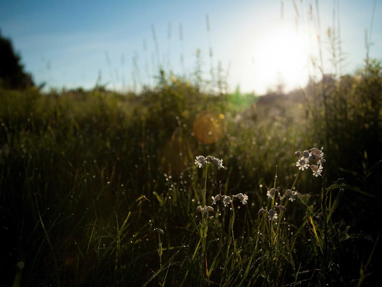
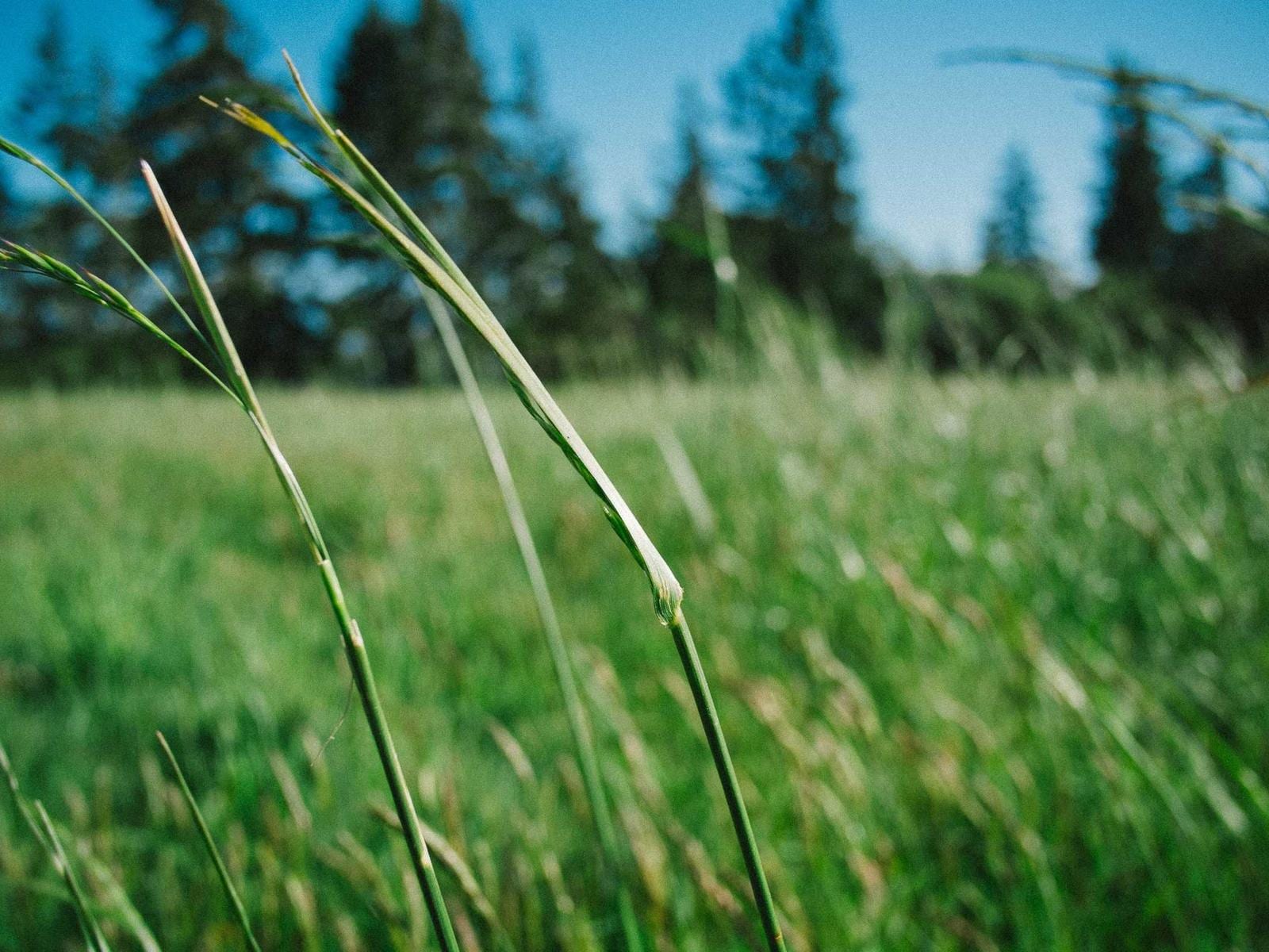
Sfeerbeelden uit de gids zijn geen bewijs van werk: ze dragen altijd het label Sfeerbeeld. Projecten tonen alleen foto's van dat project, met toestemming van de klant en zonder locatiegegevens. Nooit minderjarigen in beeld.Mood images from the guide are not proof of work: they always carry the label Mood image. Projects show only photos of that project, with the client's consent and without location data. Never minors in frame.
StemVoice
4 afspraken4 principlesSchrijf zoals ik praat in de tuin: kort, eerlijk en concreet. Eerst wat het is, dan wat het kost, dan hoe je begint.Write the way I talk in the garden: short, honest and concrete. First what it is, then what it costs, then how to start.
- 01
Ik, niet wijI, not we
GRØNN Studio is één persoon. De site spreekt in de ik-vorm en zegt je tegen de lezer.GRØNN Studio is one person. The site speaks in the first person and addresses the reader directly.
Ik kom kijken, luister naar wat je wilt en zeg eerlijk wat ik zou doen.I come and look, listen to what you want and tell you honestly what I would do.
- 02
Eerst wat en voor wieWhat and for whom first
Eén zin zegt wat ik doe, voor wie en waar, voordat er iets anders komt.One sentence says what I do, for whom and where, before anything else.
Ik maak en onderhoud vijvers en natuurlijke tuinen voor huiseigenaren in Stein en omgeving, met een vaste prijs vooraf.I build and maintain ponds and natural gardens for homeowners in Stein and the surrounding area, with a fixed price agreed up front.
- 03
Eerlijk over geldHonest about money
Prijzen staan erbij, inclusief btw. Wat verrekend wordt, staat er ook bij.Prices are shown, including VAT. What is offset later is shown too.
Leidt de doorlichting tot werk, dan was de doorlichting gratis.If the survey leads to work, the survey was free.
- 04
Alleen wat kloptOnly what is true
Geen verzonnen projecten, cijfers of reviews. Een visualisatie heet een visualisatie.No invented projects, figures or reviews. A visualisation is called a visualisation.
Visualisatie, geen foto van het resultaat.Visualisation, not a photo of the result.
Website-elementenWebsite elements
echt, niet nagemaaktreal, not mocked upHoofdknop · één per schermPrimary button · one per screen
Tweede knop · omlijndSecondary button · outlined
Tekstlink · lijn groeit aanText link · line grows in
KopieerchipCopy chip
Menu · glazen pil met komeetMenu · glass pill with comet
Pijl met voortgangsringArrow with progress ring
Sectiekop · label en aantalSection header · label and count
Van eerste blik tot onderhoud.From first look to maintenance.
LabelLabel
BewegingMotion
4 regels4 rulesRustigCalm
Beweging zit in openingen, foto's en grote tekst. Prijzen, formulieren en juridische tekst staan stil.Motion lives in openings, photos and large type. Prices, forms and legal text stay still.
Klein en preciesSmall and precise
Fijne lijnen, een dunne komeet, een ring die meeloopt. Niets groots of decoratiefs.Fine lines, a thin comet, a ring that follows along. Nothing big or decorative.
Altijd een uitwegAlways a way out
Wie minder beweging kiest, op het toestel of in Weergave, krijgt alles meteen en stil.Anyone who chooses less motion, on the device or in Display, gets everything at once and still.
Ook op de telefoonOn the phone too
De effecten van desktop draaien ook op mobiel, in een lichtere vorm, nooit verstopt.The desktop effects also run on mobile, in a lighter form, never hidden.
Wat je op deze pagina ziet bewegen, is wat de site gebruikt: tekst die woord voor woord oplicht, blokken die zacht opkomen, de komeet om de pil en het doek tussen pagina's. Zet in Weergave ‘Minder beweging’ aan om het stil te zien.What you see moving on this page is what the site uses: text that lights up word by word, blocks that rise softly, the comet around the pill and the curtain between pages. Turn on ‘Less motion’ in Display to see it still.
Vorm en gebruikForm and use
5 regels5 rules- 01
Eén oranje accentOne orange accent
Per compositie één oranje accent, zonder gloed. Oranje is de kleur van actie en herkenning.One orange accent per composition, without glow. Orange is the colour of action and recognition.
- 02
Oranje draagt antracietOrange carries anthracite
Op een oranje vlak staat antraciet tekst (4,70:1). Oranje als tekst op licht is donker oranje #A14312; #DB6923 op gebroken wit is nooit een tekstpaar.Text on an orange fill is anthracite (4.70:1). Orange as text on light is dark orange #A14312; #DB6923 on off-white is never a text pair.
- 03
Vlakke kleurenFlat colours
Vlakke kleuren, rust als herkenning. Geen verlopen, geen patronen achter tekst.Flat colours, calm as recognition. No gradients, no patterns behind text.
- 04
Rond en zachtRound and soft
Knoppen zijn helemaal rond. Kaarten en foto's hebben zachte hoeken.Buttons are fully round. Cards and photos have soft corners.
- 05
Echt werkReal work
Foto's tonen echt werk. Een sfeerbeeld draagt het label Sfeerbeeld en staat nooit bij een project; een AI-visualisatie wordt altijd zo genoemd.Photos show real work. A mood image carries the label Mood image and never sits with a project; an AI visualisation is always named as such.
Het woordmerk of de naam gebruiken in een publicatie? Mail naar hello@gronn.studio.Want to use the wordmark or the name in a publication? Email hello@gronn.studio.